Showing posts with label wallpaper. Show all posts

Monday, 10 June 2013

Wabi Sabi

I really love this summer's trend for all things Wabi Sabi, from the beautiful Miu Miu coat above, styled and photographed by Damian Foxe, to my favourite scarf of the moment below -
the fabric for this came from The Cloth House in Soho. The term Wabi Sabi refers to the Japanese aesthetic of finding beauty in imperfection, but to me the rawness and simplicity of these print effects are perfect. The trend is as strong in interior design as fashion, with these great wallpapers from Harlequin

Thursday, 25 April 2013

Deceptively modern wallpapers

I've been sourcing wallpapers for a regency property in Brighton and came accross the Little Greene wallpapers reproduced from historical archives. A lot of their papers originate from actual London addresses as with the one above from St James Place. 
This 18th Century design looks surprisingly contempory when reworked into Little Greene's colours. However property I'm working on dates from 1825, so this design is a little early.
According to Little Greene the 1800's was a key period in the evolution of wallpaper production. During this century the introduction of continuous paper reels (from France), and subsequently roller-printing in 1840, replaced the widespread, artisan technique by which individual rolls (called 'pieces' measuring 12 yards x 23 inches) were printed by hand.
Little Greenes 19th Century designs include patterns from Japan, where printing methods had evolved in a similar way to those in the west. I love this design 'Pines' - the wonderful ombre effect of the folliage seems so right for now.
Little Green suggest coordinating this design with the following colours from their paint range -    Normandy Grey, Stone - mid cool, and Fray


Tuesday, 12 March 2013

Faded Glamour; this season's colours.

Harpers Bazaar's "A Moment In Time" photographed by Yelena Yemchuk, styled by Leith Clark
I subscribe to various fashion and interior magazines, and I find it very interesting how each one covers a trend, and how this crosses from clothing to lifestyle. This month there is a feeling of romantic nostalgia; of faded glamour. The fashion story above, in Harpers Bazaar is very English country home with a decadent nonchalance.
Vogue's "Heartbreak Hotel", styled by Lucinda Chambers, photographed by Jervier Vallhonrat 
 Whereas Vogue have focused on this season's sharper, mid-century influenced silhouette, but still softened in the same wonderful faded shades, with a beautiful backdrop of De Gournay wallpaper.
Elle Decoration's "Beyond the Pale" photo Sean Myers, Stylinh Hannah Bort
These gorgeous sepia tinted tones are crossing over into interior trends, as the move away from minimalism continues. The overall effect reminds me of hand tinted photos.
Louis Vuitton Autumn Winter 2013/14
This soft and sensuous colour story is very current, but also set to run through to next autumn, as shown at the Louis Vuitton catwalk show last week. A fabulous mix of colour, pattern and texture - dreamy!

Sunday, 30 September 2012

London Design Shows

The recent London design shows were the best I've seen in a long time - here are some of my favourite finds.

 Julie Kouamo's hauntingly romantic wallpaper - Exotic Vine from her new Bangou Collection at 100% Design.


Bethan Gray's elegant and beautifully crafted 'Brogue' leather -topped, solid wood tables at Design Junction.

Flaster  concrete tiles at SuperBrands, I adore how traditional tile designs have been reinterpreted in a truly modern way. I had seen these tiles previously in Liberty's - gorgeous.
And finally, this completely brilliant concrete design from The Sculpture House at Design Junction
  formed of cut concrete paving blocks, the reassembled textured pieces resemble a stunning luxury carpet.

Monday, 4 July 2011

Coventry City Centre Health Facility - Digital Artwork Project

The main palette
One of my current work projects, is as colour consultant and arts coordinator for the new City Centre Health Facility in Coventry. Working with the architect Cressida Toon's vision, I have developed a colour palette based on Coventry's urban landscape, it's ever changing society and industrial heritage. This main palette is a mix of brick, slate, lead and copper in different states of erosion.Further subsidiary palettes have been developed for each floor, each based on a metal: Iron, Bronze, Brass, Copper and Steel. These palettes are for wayfinding, interior design and as inspiration for the artworks.
Third Floor - Copper, by Kelly MacPhee
As part of the arts programme, I set up a competition with Coventry University to design digital artworks for each floor of the centre; these large scale artworks are to be digitally printed onto wallcoverings and positioned to aid orientation around the building. Kelly MacPhee's designs were selected for all floors, her brilliant use of the colour palettes and the metallic themes, produced beautiful images that work from a distance and close up. I can't wait for the artworks to be installed!
First Floor - Bronze, by Kelly MacPhee
   

Saturday, 28 May 2011

Clerkenwell Design Week

It was Clerkenwell Design Week this week and what really interested me is how designer/makers are relooking at tradition, taking the best of it and producing something knew and thought provoking in reponse.


The House Of Hackney have 'reworked traditional homewares for a new generation'; their Dalston Rose range of soft furnishings, wallpaper and home accessories have mixed ombre effects with an antique rose print to recreate a contempory antidote to the years of minimalism we've seen in home interiors. Just devine!


Brighton based Sean Dare of Dare Studio has designed this trully modern winged chair, Sean's clean lines have updated this furnishing classic into a wonderfully contemporary piece. The return of the winged chair seems just right now; the acoustic qualities gained through the design are brilliantly for blocking out mobile phones and other annoying modern day noises. 

Thursday, 19 August 2010

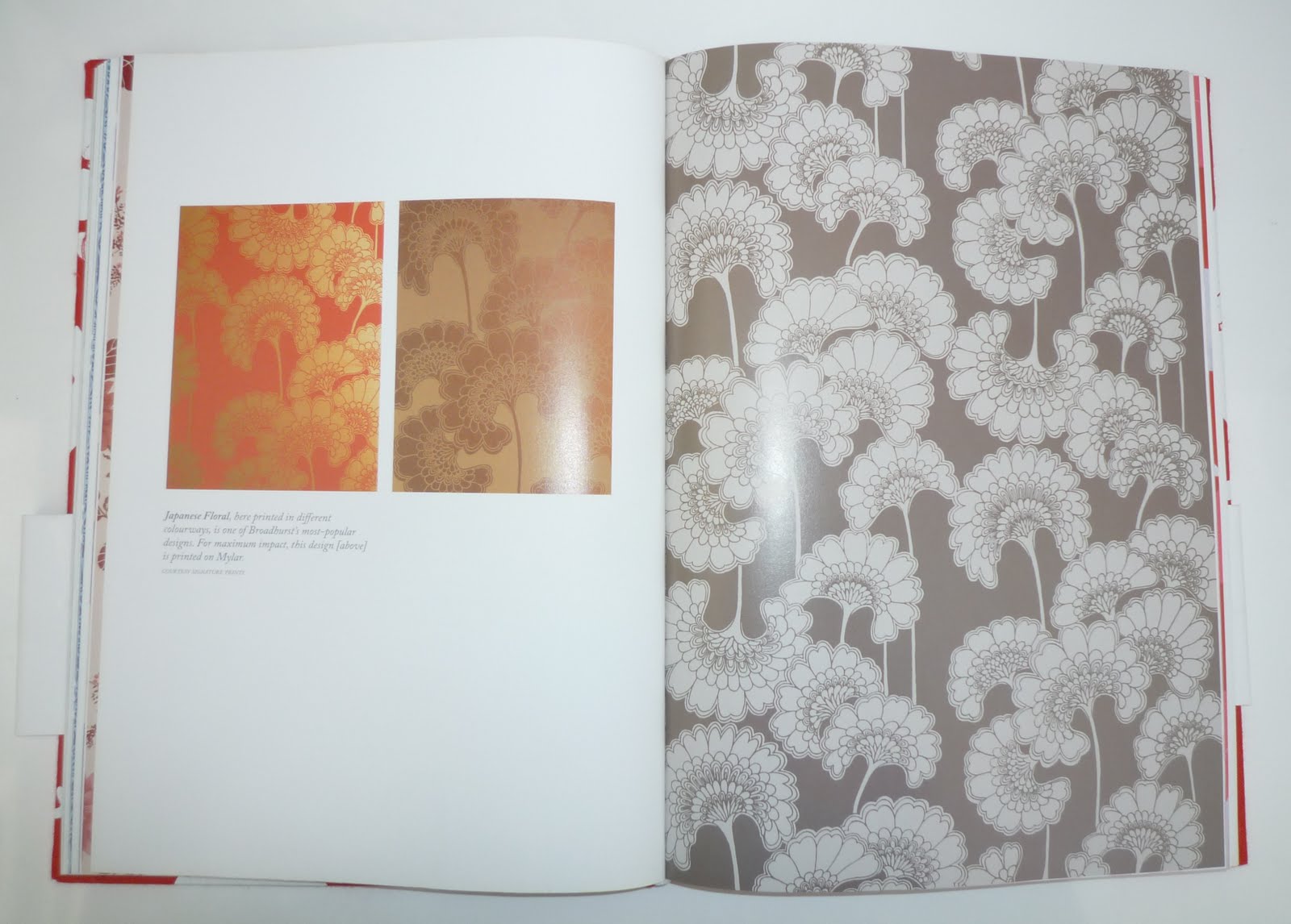
Florence Broadhurst


My friend Kate gave me this fabulous book - Florence Broadhurst, Her Secret & Extraordinary Lives by Helen O'Neill. I had known of her range of wallpapers, but this book takes you through her life and work, both of which are extraordinary! If you are interested in pattern and surface design I recommend you be inspired by this book.