Kaarina uses simple everyday objects to create large scale installations that articulate the architectural or open spaces in which her work is sited - 'A shirt is the closest to the heart, so that is why I use shirts. The person is there'. Well I think this is magical!
Showing posts with label architecture. Show all posts
Saturday, 4 May 2013
Brighton Festival
Kaarina uses simple everyday objects to create large scale installations that articulate the architectural or open spaces in which her work is sited - 'A shirt is the closest to the heart, so that is why I use shirts. The person is there'. Well I think this is magical!
Wednesday, 16 January 2013
My pink crush.
![]() |
| Hawkins Brown Biochemistry Building, University of Oxford WAN photos Tim Crocker |
![]() |
| Raf Simmonds for Jill Sander A/W 2012 / The Sartorialist Milan 20.4.2012 |
So the trend for the neutral and pink mix just grew on me. I started to see versions of this palette everywhere; form Farrow and Ball's promotional pictures above, to these palettes below from the ever inspiring La Boheme blog
But the level of pink that completely swung it for me, is this subtle shade of blush.....
![]() |
| The Independent magazine 29.12.2012 |
Tuesday, 13 November 2012
City of Coventry Health Centre - Award winner!
Last week City of Coventry Health Centre won the Building Better Healthcare "Clinicians Choice" award. This is fabulous recognition for a project I was involved with, and for the team at Coventry Care Partnership and architect Cressida Toon of Sonnemann Toon Architects.
![]() |
| The Brass palette for the 2nd Floor - Dentistry, Physiotherapy and Podiatry |
![]() |
| The Copper palette for the 3rd Floor - Sexual Health |
![]() |
| The Bronze palette for the 1st Floor - GP Services |
Sunday, 28 October 2012
Yelo
At the recent World Architecture Day I spotted a man in a great pair of yellow trousers - they really stood out in the sea of black and grey worn by everyone else. Later on I was introduced to Andy Parsons of Yelo Architects and heard that he always wears an item of yellow clothing. By coincidence we met again and he was in one of his yellow shirts - what struck me was, that unlike some architects who wear colour as a moniker, Andy wears his with style.
I thought it would be interesting to talk to him about his style and relationship with the colour yellow - so I googled yellow architect and found Yelo Architects - easy! And clever - by dropping an l and the w, he's created a great word somewhere between yell and hello, that really reflects the values of the colour. The human eye process yellow before other colours in the spectrum, due to the amount of light reflected and when paired with black, as in Yelo Architects' logo, is the easiest colour to read. We associate yellow with hope cheer and vitality - it is a joyful colour, just like the word Yelo.
Andy started wearing yellow at college and it has now become an integral part of his professional identity. It is an exact shade of yellow that he chooses, almost Process Yellow, and he's lucky because he can wear it. It is also the Giallo Fly colour from Ferrari - very clean yellow, sharp and fresh.
I have used a similar yellow to highlight the entrance to a building and also reception desks - just like Andy's trousers, it really stands out and attracts our attention from a distance.
Friday, 24 August 2012
Finchley Memorial Hospital
The greens of the colour palette I developed were inspired by the hospital's setting within a proposed health campus of therapy gardens, community gardens and playing fields; the gardens will be part of phase two to be completed next year. I have selected the levels of green to provide a sense of calm and reassurance while inspiring feelings of hope, renewal and rejuvenation.
Green has traditionally been associated with hospitals. It is especially used in operating theatres where surgeons are carrying out close work involving red blood - to look away towards a level of green allows the eye to rest and refocus.
Thursday, 3 May 2012
Golden Excess
On my way back from Vietnam, I stopped off in Hong Kong to spend a few days with friends. We had lunch at the Tin Lung Heen restaurant in the Ritz Carleton. The interior is very opulant, with some great dramatic spaces like the corridor pictured above but the rest of the interior design was not my style. This place is so bling they even put gold leaf on the dim sum!
The food was fabulous and so were the astonishing views across the harbour.
Tuesday, 3 April 2012
Temple Pink
How to describe this incredible shade of magenta pink, it's not just the vividness of this colour, but the quality of the chalky pigment-rich paint on the walls.
These pictures are taken in a temple in Saigon, I've seen this pink in India too, but here in this city temple it had the most wonderful quality. I could have stood there for hours just absorbing it's intensity.
Labels:
architecture,
colour,
inspiration,
Interiors,
Travel
Monday, 16 January 2012
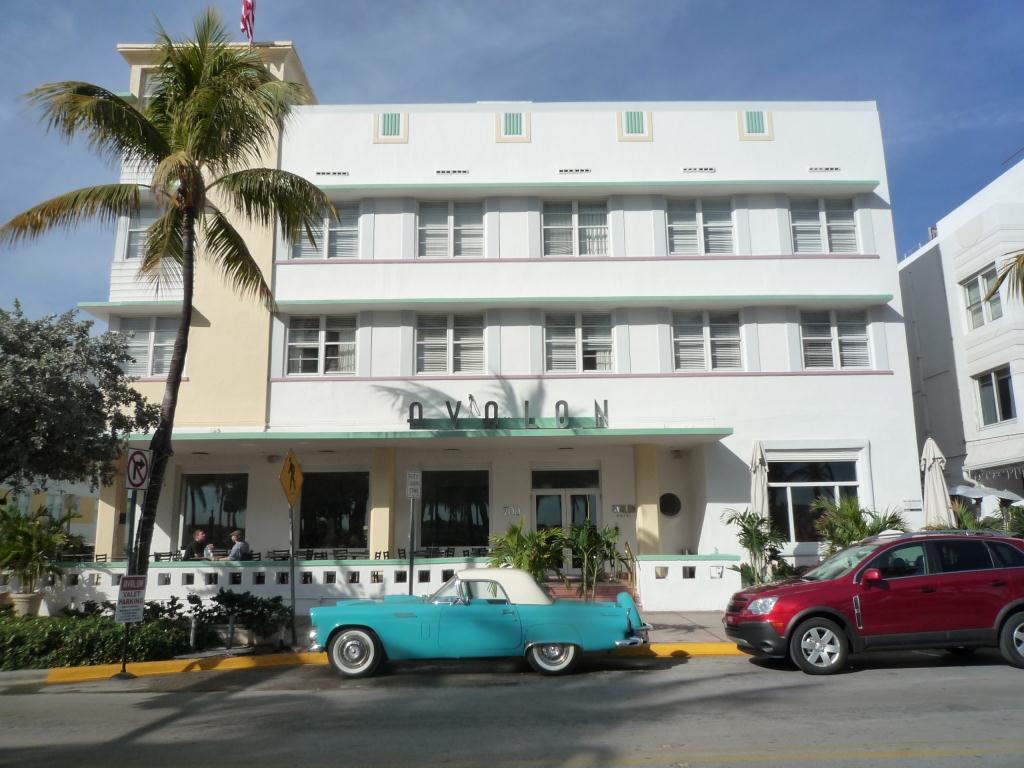
South Beach Miami
I spent the first week of January in South Beach, Miami and I loved it! The fabulous Art Deco buildings are reminiscent of confectionery, all crisp white tiers with sugar coloured trims.
The buildings have great signage from the hotels on Ocean Drive right through to these public conveniences!
My souvenir from the trip is this brilliant book by David Leddick - 'In The Spirit of Miami Beach', it really captures the essence of the place, a great read and stunning pictures.
Just what I need to get through January!
The buildings have great signage from the hotels on Ocean Drive right through to these public conveniences!
My souvenir from the trip is this brilliant book by David Leddick - 'In The Spirit of Miami Beach', it really captures the essence of the place, a great read and stunning pictures.
Just what I need to get through January!
Labels:
architecture,
Book,
colour,
Graphics,
inspiration,
Interiors,
Travel,
Vintage
Friday, 21 October 2011
Analogical Colour in Architecture
![]() |
| Ceiling hung accoustic panels |
![]() | ||
| The shades of colour follow through into the WC areas |
![]() | ||||
| Blues to Mauve |
It's so refreshing to see a school that doesn't patronise its pupils with use of arbitory primary colours - inspiring!
Monday, 17 October 2011
Bighton's Big Wheel
I love this new addition to Brighton's seafront. Hopefully we'll get Marks Barfield's proposed i360 soon!
Monday, 3 October 2011
WAN Case Study
![]() |
| City of Coventry Health Centre under construction |
Wednesday, 21 September 2011
Modern Marrakesh
![]() |
| Cafe Arabe - Terrace |
![]() | |||
| The hallway |
![]() |
| Beautiful lanterns light the entrance |
Labels:
architecture,
colour,
Fabric,
inspiration,
Interiors,
Travel
Monday, 4 July 2011
Coventry City Centre Health Facility - Digital Artwork Project
![]() |
| The main palette |
![]() |
| Third Floor - Copper, by Kelly MacPhee |
![]() |
| First Floor - Bronze, by Kelly MacPhee |
Labels:
architecture,
Art,
colour,
Illustration,
Interiors,
pattern,
wallpaper
Thursday, 5 May 2011
Metropol Parasol
How amazing is this! The Metropol Parasol in Seville is the world's largest wooden structure. Designed by J. Mayer H. Architects
It took 4 years to complete and was finished in April of this year -www.yatzer.com/Metropol-Parasol
Thursday, 4 November 2010
De La Warr Pavilion
I visited the De La Warr Pavilion last weekend. Stunning in the autumn sunshine! Anyway there's a great history here. If you're in Bexhill do visit.
Thursday, 7 October 2010
Save Saltdean Lido

This is a really worthwhile campaign; Saltdean Lido is under threat from the current leaseholder who plans to develop the site for an extensive residential development. The Friends of Saltdean Lido would like to retain this Grade 2 listed example of modernist architecture.
![]() | ||||||
| The Lido in it's heyday |
The Friends of Saltdean Lido have been assisted by Conran and Partners in proposing an alternative plan that will improve the facilities and amenities for the community, while retaining the original building.
Sunday, 19 September 2010
Alacati, Turkey
| Tas Otel, Alacati |
![]() |
| A street in Alacati |
At the Tas Otel they serve the best breakfasts on the beautiful terrace overlooking the garden.
| The terrace |
And between 5 and 7pm they serve tea and cakes using their own produce and preserves.
| Preserves fermenting in the garden |
The whole hotel was just gorgeous. Inside the interior is quite simple - stone with white plaster and all woodwork glossed in the subtlest pale blue.
Labels:
architecture,
colour,
inspiration,
Interiors,
Travel
Subscribe to:
Posts (Atom)