Showing posts with label Graphics. Show all posts

Wednesday, 18 February 2015

The Maker's Atelier - a journey in colour selection

For the last twelve months I've been working on a very personal project that has become The Maker's Atelier. I have always made my own clothes and when someone suggested I publish my own dressmaking patterns, I thought it was an interesting idea. I've never bought dressmaking patterns, they're not very fashionable and they don't relate to my style. So I felt here was a gap in the dressmaking market where I could introduce a level of style and sophistication. But the interesting thing is the colour journey that has taken place during the development of The Maker's Atelier brand and its products.
I started the business concept the same way I start all my projects with a moodboard.  I take what I think are the key ingredients, which I then embellish, and then edit, until I've captured the essence of what I'm trying to create. Above is part of the moodboard; on the left is the section that relates to my own wardrobe, including my clothes-rail with the colours I wear - blues to greys to white with tans and sands for summer. On the righthand side are my first thoughts on branding - I knew I wanted a classic understated logo that would last and that ideally it would be in grey as this is the perfect "backdrop" colour.
 I worked with Eighth Day Design who have created all my previous websites and branding to develop The Maker's Atelier. They did a brilliant job including creating The Maker's Atelier type face inspired by the stencilled type found on dressmaking mannequins. The full branding story can be found here and as you can see we kept to the greys for the branding. It was a different story with the clothing....

The plan was to illustrate the patterns, with real size 12 women, photographed using natural light wearing a series of blue samples. But following the first test shoot with photographer Amelia Shepherd, I realised that we couldn't see the garment details with the depth of blues I had chosen. This detail is integral to dressmakers - they need to see the seams etc of what they are going to make. So I had a week in which to recreate all the samples in paler neutrals. The colour selection had become driven by the technicalities of the photographic look we wanted and the suitable fabrics I could quickly lay my hands on.
For the shoot location we used the building where The Maker's Atelier is based in Kemptown Brighton - there are a series of large rooms but the best background we have found is a pale grey; Dulux 00NN 53/000. This is completely neutral with a high Light Reflective Value (53) so the natural light can bounce around and soften the look.
After the final shoot we chose the images above for the first six pattern fronts which were published last August. Since then I've been experimenting with pattern and other colours in preparation for the next set of styles. But its a fine line with what works and what doesn't. But as a designer its been a fascinating journey perfecting everything into a saleable product - the results can be viewed here www.themakersatelier.com

Monday, 4 November 2013

Merchant & Mills - a maker's paradise


During the week I am a designer, but on the weekend I'm a maker. So it was wonderful to visit the Merchant and Mills shop in Rye - this really is a maker's paradise.
An emporium of everything to do with sewing from patterns and fabrics, through to all sorts of notions. Merchant and Mills is the creation of Carolyn Denham and Roderick Field. Carolyn is the maker, responsible for the patterns and sewing side, while Roderick is the graphic designer responsible for the  packaging and stationary.

As you can see from the photographs the store is beautifully considered, as is the Merchant and Mills website and online store. On the website they also have a great video about their enterprise see here.
So what did I buy? …. all sorts of hardware for my bag making, a super sharp awl, more tailor's chalk…. but best of all their Maker's Journal. This is fabulous, it's a note book that concertinas out. The beauty of this is that you can add fabrics and things without it bulging to one side. Also you can view all of the contents at once. I'll be using my Journal for my next big personal project - designing my new flat!

Tuesday, 10 July 2012

Black Wedding

I knew when I received the invite above, that my niece's wedding would be stylish. The black and white theme followed through all the wedding stationary, table sttings, cake.....

and to these wonderful boxes to take a cup cake away in....
The colour black exudes sophistication and style; beloved of luxury brands for their logos, it is one of the most important colours in the fashion world.  


Thursday, 26 April 2012

Colour in Design

I'm giving a lecture on Colour in Design for the South East Design Forum next Wednesday. I worked with Richard Wolfstrome to create this poster, I hope it's a really inspirational evening for everyone who's going to be there.

Saturday, 4 February 2012

Cuban shirts - Guayabera


During our stay in Miami we had a Cuban day - we headed over to Little Havana and the marvellous La Casa de Las Guayaberas on 8th Street. This is the store if you wish to buy a retro-hip Cuban shirt known as the guayabera -- a loose-fitting, pleated, four pocket button-down shirt.
Founded by Ramon Puig, who emigrated to Miami over 40 years ago, the store stocks every imaginable variation, Ramon still uses the same scissors that he arrived with. No one in the store speaks any English but they have produced a short history of the guayabera in this little booklet – I love the graphics. Afterwards we lunched at Versailes, a hugh mirror-lined restaurant, full of Cuban families having a great time. 

Monday, 16 January 2012

South Beach Miami

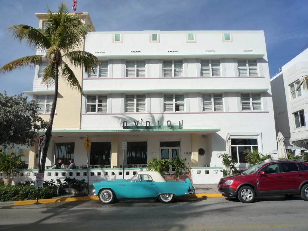
I spent the first week of January in South Beach, Miami and I loved it! The fabulous Art Deco buildings are reminiscent of confectionery, all crisp white tiers with sugar coloured trims.
The buildings have great signage from the hotels on Ocean Drive right through to these public conveniences!
My souvenir from the trip is this brilliant book by David Leddick - 'In The Spirit of Miami Beach', it really captures the essence of the place, a great read and stunning pictures.  
Just what I need to get through January!

Sunday, 20 March 2011

Sludgy Colours

Illustration by Alexander Wellstheartworksinc.com 
It's unusual for me to be drawn to muddy or sludgy colours but I saw this illustration by Alexander Wells in the FT last weekend; it's a fabulous illustration that worked especially well with the pink newsprint paper. I kept the illustration on my desk and it's influenced my colour choices this week.
On Wednesday, while taking a break from giving a seminar on Colour at The Fashion Retail Academy, I popped into Paperchase as I love stationary...dissaster! I ended up buying these beautiful little boxes of stationery from East Of India all in natural taupe shades. I'll never use them - they're too beautiful!
The People's Prints
I finished the week being fascinated by this great menwear fashion spread, styled and photographed by Damian Foxe in How To Spend It. I love this magazine, it's so far from everyday reality, it's style on another level.

Monday, 15 November 2010

Maria Rivans


I've mentioned the work of Maria Rivans before, I love the detail and the mixing up of images. So it's great that some of her work is now available as greetings cards from the card company Pearl and Black   

Sunday, 17 October 2010

Colour

I'm in need of bright colour this week - and I love the colour combinations in these Shanghai Tang notebooks and stickers. I bought them several years ago and still haven't written in them they're too beautiful!

Monday, 16 August 2010

Vintage Goodwood

Got back late last night from Vintage Goodwood - exhausted, but with Heaven 17 's Temptation still ringing in my ears.
Vintage at Goodwood is billed as not merely a music festival but a festival where music, fashion and design should never be seperated. There were plenty of vintage fashion stalls but also some more unexpected shops, I really enjoyed the Kenwood Kitchen Appliance store, great store set complete with 'Fanny Craddock' cookery demonstrations.
 

Vintage Kenwood food mixer

And being Goodwood there were plenty of vintage vehicles......


Most stylish musician.... Kid Creole, who performed a great set with his Coconuts...

But the best thing ...... people watching, some people were so in-tune with their era it was frightening!
As seen outside the Soul Casino

Friday, 30 July 2010

My brand in a book

My brand in a book!

I called round to Eighth Day today and they gave me a copy of this book - it's very exciting!

The team at Eight Day designed all my branding and website including my devine logo and wallpaper which is featured in this book - Mini Graphics . Congratulations to all at Eighth Day especially Jo and Sarah.