 |
| Yosemite - New Year 2002 |

colour, pattern, texture, fashion, interiors, architecture, arts....
Sunday, 23 December 2012
Sunday, 25 November 2012
Maison Martin Margiela with H&M


Tuesday, 13 November 2012
City of Coventry Health Centre - Award winner!

 |
| The Brass palette for the 2nd Floor - Dentistry, Physiotherapy and Podiatry |
 |
| The Copper palette for the 3rd Floor - Sexual Health |
 |
| The Bronze palette for the 1st Floor - GP Services |
Sunday, 28 October 2012
Yelo

At the recent World Architecture Day I spotted a man in a great pair of yellow trousers - they really stood out in the sea of black and grey worn by everyone else. Later on I was introduced to Andy Parsons of Yelo Architects and heard that he always wears an item of yellow clothing. By coincidence we met again and he was in one of his yellow shirts - what struck me was, that unlike some architects who wear colour as a moniker, Andy wears his with style.

I thought it would be interesting to talk to him about his style and relationship with the colour yellow - so I googled yellow architect and found Yelo Architects - easy! And clever - by dropping an l and the w, he's created a great word somewhere between yell and hello, that really reflects the values of the colour. The human eye process yellow before other colours in the spectrum, due to the amount of light reflected and when paired with black, as in Yelo Architects' logo, is the easiest colour to read. We associate yellow with hope cheer and vitality - it is a joyful colour, just like the word Yelo.

Andy started wearing yellow at college and it has now become an integral part of his professional identity. It is an exact shade of yellow that he chooses, almost Process Yellow, and he's lucky because he can wear it. It is also the Giallo Fly colour from Ferrari - very clean yellow, sharp and fresh.

I have used a similar yellow to highlight the entrance to a building and also reception desks - just like Andy's trousers, it really stands out and attracts our attention from a distance.
Wednesday, 10 October 2012
Navy Blue


Sunday, 30 September 2012
London Design Shows
The recent London design shows were the best I've seen in a long time - here are some of my favourite finds.

Julie Kouamo's hauntingly romantic wallpaper - Exotic Vine from her new Bangou Collection at 100% Design.


Bethan Gray's elegant and beautifully crafted 'Brogue' leather -topped, solid wood tables at Design Junction.

Flaster concrete tiles at SuperBrands, I adore how traditional tile designs have been reinterpreted in a truly modern way. I had seen these tiles previously in Liberty's - gorgeous.
 And finally, this completely brilliant concrete design from The Sculpture House at Design Junction
 formed of cut concrete paving blocks, the reassembled textured pieces resemble a stunning luxury carpet.


Friday, 24 August 2012
Finchley Memorial Hospital


Tuesday, 10 July 2012
Black Wedding


and to these wonderful boxes to take a cup cake away in....
The colour black exudes sophistication and style; beloved of luxury brands for their logos, it is one of the most important colours in the fashion world. 
Wednesday, 13 June 2012
Exquisite Exhibitions


With both brands the colour red is indelible; for Louboutin it is the signature lipstick red soles to all his shoes, and with Hermes its the intense orange red for its packaging and branding. These powerful reds both elude to luxury, but to me Louboutin's red is about sexual danger and the Hermes red is about the richness of heritage.
Thursday, 7 June 2012
Clerkenwell Design Week
Here are some of my highlights from Clerkenwell Design Week


And I found these Chool seats ingenious - when you sit on the seat, the body of the chair slowly drops down and the back moves up. A neat cube shape when not in use, but really comfortable to sit in - great for a reception area.

Finally how marvelous to see the BarberOsgerby Olympic Torch prototype and developments at Vitra - Stunning!
Sunday, 13 May 2012
Snowdon Blue

Sixty of Snowdon's portraits have now been presented in a book, published by the Swedish fashion company Acne Studios, called Snowdon Blue. To coincide with the book and the exhibition of the portraits in the Acne Studio's store in Dover Street, London, the clothing company have designed a limited edition of blue shirts.
The portrait of David Bowie is extraordinary, but I think portraits of him always are, I find his eyes disturbing and compelling at the same time.

Thursday, 3 May 2012
Golden Excess


Thursday, 26 April 2012
Colour in Design

Tuesday, 3 April 2012
Temple Pink


Thursday, 22 March 2012
Saigon Markets


Saturday, 4 February 2012
Cuban shirts - Guayabera

During our stay in Miami we had a Cuban day - we headed over to Little Havana and the marvellous La Casa de Las Guayaberas on 8th Street. This is the store if you wish to buy a retro-hip Cuban shirt known as the guayabera -- a loose-fitting, pleated, four pocket button-down shirt.

Founded by Ramon Puig, who emigrated to Miami over 40 years ago, the store stocks every imaginable variation, Ramon still uses the same scissors that he arrived with. No one in the store speaks any English but they have produced a short history of the guayabera in this little booklet – I love the graphics. Afterwards we lunched at Versailes, a hugh mirror-lined restaurant, full of Cuban families having a great time.
Monday, 16 January 2012
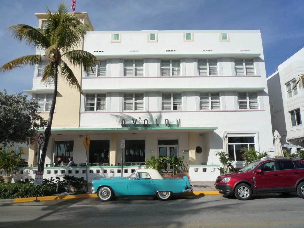
South Beach Miami


Subscribe to:
Posts (Atom)